The fear of getting falsely accused of rape just doesn’t compare to the fear of an actual rapist getting away with his or her crime. Statistics from Justice Department, National Crime Victimization Survey: 2006-2010 and FBI reports. NOTE (2/6/13): As so many people continue to visit this site and share this convo-graphic, we’ve updated this post to include the context from this post.
As a wife, mom, survivor, and regular person until Monday morning, I am overwhelmed and astounded by the reaction and response to the “Truth About False Accusation” infographic, and encouraged by the dialogue that has emerged as a result of it. Thank you to each and every person who shared it, debated it, loved it, and hated it.
We accept and encourage debate on this and any future infographics released by The Enliven Project. Given the massive amount of media coverage and online discussion about it, I wanted to provide some additional – and more well-thought out – context to the purpose of the graphic and The Enliven Project, as well as to address a bit of criticism about the data we used.
The purpose of this graphic is to compare (primarily men’s) fear of being falsely accused of being a rapist to the many challenges around reporting, prosecuting, and punishing rapists.
Two key figures drive that point home:
- A reporting rate of 10%
- A false reporting rate of 2%
The other decision we made was to present data that fell within documented ranges, rather than reflect the findings of a particular report, because of the inherent challenge in collecting data on this issue. Said another way: at the moment, an argument could be made that every source is flawed in some way. The reason we pursued a composite approach instead of relying on one study was exactly to spark discussion about the underlying data and definitions, and – perhaps most importantly - the current challenges in data collection.
For example – here are a handful of challenges that we encountered while putting together the infographic and, as a result, some limitations of the infographic itself:
- The federal data provides arrest, conviction, and incarceration rates on forcible rape only, NOT other forms of sexual violence.
- Until 2012, the federal definition of rape was limited to penetration of a vagina by a penis. Therefore, 100% of rapists would have to be men.
- The difference between a false report (how data is counted and being falsely accused (the fear at the individual level). Lonesway, Archembault, and Lisak, the authors of the article from The National Center for the Prosecution of Violence Against Women, use the following definition: A false report is a report of a sexual assault that did not happen (i.e., it was not completed or attempted).” The report goes on to discuss the challenges of defining whether the assault in fact didn’t happen or whether investigators or prosecutors decide that it did not happen based “simply on their own views of the victim, the suspect, and their credibility.” Individuals who are falsely accused of rape outside of the justice system would not be counted in this figure.
Despite these admitted flaws, here’s what’s not disputable:
- Rape and sexual violence continue to impact men, women, and children across the country and around the world.
- Fewer than 100% of rapes are reported to the police because social, emotional, and legal barriers still exist.
- Sexual violence has an enormous emotional and financial cost to our society, and many bystanders don’t even know they are being affected by it when in reality, they are.
- Individuals, foundations, employers, and the government do not invest deeply enough in awareness, prevention, intervention and recovery.
- Our justice system isn’t perfect. Sometimes innocent people are charged. And sometime guilty people go free. That doesn’t mean that men and women aren’t being raped and sexually assaulted. It means there are improvements that can be made all around.
Finally, there is something that this graphic does NOT represent. And that is the impact of false accusation on an individual’s life. The purpose of the graphic was to put the FEAR of false accusation in perspective, not to discount the very real impact that a false report or false accusation has on someone’s life.
We certainly plan future infographics and have learned from this overwhelming and humbling response that visualizing these issues can be quite powerful, and careful sourcing and stating assumptions up front is also important. Our primary goal – and that of The Enliven Project as a whole – was to start a conversation that desperately needs to be had in our country. We’ll let others decide whether or not we were successful on this front. However, in the future, the kind of analysis and background information provided here and below will be made available at the time the infographic is released so that there are no misconceptions about our intent and message.
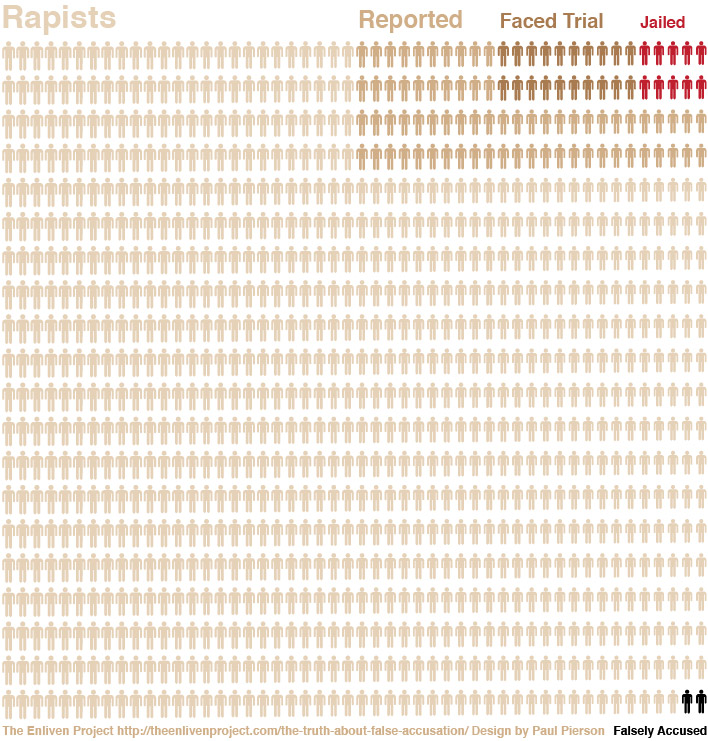
Breakdown of Graphic and Statistics
1,000 Rapists (technically 1,000 rapes as pointed out by Slate, a distinction we missed in an effort to bring some reality to the numbers.)
Of those 1,000 rapes, we applied a 10% reporting rate (100)
- Source: http://www.hmic.gov.uk/media/without-consent-20061231.pdf
Page 8: “Estimates from research suggest that between 75 and 95 per cent of rape crimes are never reported to the police.” - Source:http://bjs.ojp.usdoj.gov/index.cfm?ty=dcdetail&iid=245 (2011 Criminal Victimization Survey): Reported to the police (US): 27% in 2011, 49% in 2010
Of those 100 reported rapes, we show 30 faced trial (this includes those that were jailed). This is 30%. Faced trial, for the purpose of this graphic, uses composite data reflecting the terms prosecution, arrested, and faced trial.
- RAINN (http://www.rainn.org/get-information/statistics/reporting-rates) lists for 46 rapes, 9 get prosecuted. This is 19.5%.
- Tjaden, P., & Thoennes, N. (2006). Extent, nature and consequences of rape victimization: Findings from the National Violence Against Women Survey. Washington, DC: U.S. Department of Justice. - 37% of reported rapes are prosecuted
- Patterson, D., & Campbell, R. (2010). Why rape survivors participate in the criminal justice system. Journal of Community Psychology, 38(2), 191-205. - 14-18% of reported rapes lead to prosecution
- http://www.fbi.gov/about-us/cjis/ucr/crime-in-the-u.s/2010/crime-in-the-u.s.-2010/clearances - 40% clearance rate in 2010 (arrested or cleared by exceptional means)
Of the 100 rapes brought to trial, 10 are jailed. This is 10%. Or, of the 30 rapes prosecuted, 10 are jailed. This is 33.3%.
- When considered 10% of the 100 reported rapes: http://www.ncpa.org/pub/st229?pg=11Table A-4 in 1997, Probability of prison for rape is 9%.
- When considered 10% of the 100 reported rapes: http://bjs.ojp.usdoj.gov/content/pub/pdf/fdluc06.pdf
page 11 in 2006: 62% of felony rape defendants are convicted, 50% of a felony
page 12 in 2006: most severe sentence of convicted offenders
For rape: 80% incarcerated. Combining these, 0.62 * 0.8 = 0.496 (49.6%) - When considered as a portion of prosecuted rapes that are jailed: RAINN (http://www.rainn.org/get-information/statistics/reporting-rates) lists for 9 prosecuted rapes, 3 are jailed. This is 33.3%.
Of the 100 rapes reported, 2 are false accusations. The 2% false accusation rate was applied only to the number of reported rapes.
- Source: http://www.ndaa.org/pdf/the_voice_vol_3_no_1_2009.pdf page 2: “when more methodologically rigorous research has been conducted, estimates for the percentage of false reports begin to converge around 2-8%.”
As it’s three years later, I doubt I’ll get any response to this. It’s also possible that the issues I’m going to bring up have been mentioned by other commenters, but I haven’t got the time to read through each and every one of the comments. I do see a number of serious flaws in the presented “infographic” however.
First, the location of the falsely accused figures. They are included under the category of “rapists.” If they are indeed falsely accused this would seem an inappropriate category for them to be placed under.
Second, the falsely accused figures are placed under the “not reported” category, but this also makes no sense. In order to be falsely accused, one must first be accused. They should be located, at the very least under the “reported” category. I understand how this might seem at odds with my first point, but given the graphic’s presumption of guilt, it’s hard to know where else to place them. Also worth pointing out is that at least some of those falsely accused will be tried, and worse, some of those will be convicted.
Third, and perhaps most egregiously, the raw information presented is in percentages, but the chart presents 1,000 figures. I’m sure you have good reasons for this, and it wouldn’t be a problem except that you haven’t scaled up the number of falsely accused to match. Based on the raw data the graphic ought to have between 20 and 80 figures under the “falsely accused” category. I say that this is perhaps the most egregious error because it represents a substantial misrepresentation of the number of falsely accused. Moreover, considering that you did appropriately scale up the number of reported, tried, and convicted “rapists” one could be forgiven thinking this more than a mere oversight. Someone who simply looks at the infographic without bothering to check the raw data could easily be led to believe that the false accusation rate was only 2 in 1000, or 0.2%.
Kevin, thanks for your comments here. Much of this has been addressed through other posts and also on this one. This graph is based on a 10% reporting rape, and assumes that a false accusation can only exist if something has actually been reported. Thus the 2 in 1000.
Amanda Marcotte at Slate also wrote a thoughtful critique, which you can read here: http://www.slate.com/blogs/xx_factor/2013/01/08/the_enliven_project_s_false_rape_accusations_infographic_great_intentions.html.
And if you are wondering why I haven’t revised the original graphic, you can look here: http://theenlivenproject.com/the-truth-about-false-accusation-revisited/
I’d also encourage you to check out some of the other graphics I’ve created since this one started circulating. The issue of false accusation is just one aspect of sexual violence, and there is more we can understand and share to help male and female survivors reach their full potential
Best, Sarah
[…] 10. False accusations of rape and sexual assault are exceedingly rare. […]
How do you get the numbers of unreported rape?
[…] Rape statistics by The Enliven Project […]
[…] that is some number of false accusations that do occur. According to some feminist groups that number is only 2%, but an actual study, albeit a small one, places the number at 41%. I’m pretty sure that […]
[…] author felt obliged to further explain the data and provided sources in a blog that can be found here. I think this is a good example of what can happen if you fail to cite your data in an […]
[…] to law enforcement. Different estimates put the number of rapes that go unreported between 68 and 90 […]
[…] http://theenlivenproject.com/the-truth-about-false-accusation/ […]
US Population: 250 million
Female population: 125 million
1 in 4 women are raped: 31.25 million
2% of those are false accusations: 625,000
So, using their statistics (high percentage of rape and low percentage of false accusations), there are 625,000 Americans falsely accusing people of rape. That’s not a low number. That’s like the entire state of Vermont falsely accusing someone of rape.
[…] recent attention on UVA and the Rolling Stone story, there has been a new wave of discussion about The Truth About False Accusation graphic on social media and even on the Washington Post that has compelled me write about this […]
[…] Paul Pierson as the subject of my critique. The infographic is part of a blog post titled “The truth about false accusation” from the website “The Enliven Project” which aims to educate readers on the […]
[…] Beaulieu, S. (2012, December 1). The truth about false accusation [Online image]. Retrieved from http://theenlivenproject.com/the-truth-about-false-accusation/ […]
Hi Sarah,
A modified version of your graph has been translated to Spanish and largely shared on Twitter and Facebook. I felt the percentage of false accusation was too low to be true, so I started investigating and found your website.
I also took my time to read the whole article “False Reports: Moving Beyond the Issue to Successfully Investigate and Prosecute Non-Stranger Sexual Assault” on whose data this graph is supposed to be based on and found that the graph didn’t really translate the numbers of the article.
So I wrote a large entry on my blog (you can get to it by clicking on my nick in this comment) explaining all the things that I found to be wrong in it. It’s quite a large text and it’s in Spanish, so I thought I should let you know what information I feel is wrong there, in case you are interested in fixing it:
1 - You are basing your graphic on an article that estimates a percentage between 2% and 8% of false accusations, but picked only the lowest value (2%). If you don’t want to use 2 different values on your graph to make it easier to see, it would be more fair to pick an average value of 5% instead.
2 - You have created the graphic adding also estimations of the total amount of rapes, and including reports, trials and jailed all as a subgroup inside it. This has 2 negative effects.
First, it makes it look like the amount of false accusations is 0.2% instead of 2%-8%.
Second, the fact that an acusation could not be proven false does not mean that it was true. By adding all of the accusations as a subgroup of the rapists you are assuming that the 90% of cases that didn’t end in a prison sentence were also true! That’s far from right. We know for sure that many of these will be cases where lack of evidence led couldn’t avoid a rapist from remaining free, but the only truth is we don’t know how many were.
In my opinion, it would be best to keep reports and estimations based on surveys as different graphics to avoid these misleading information.
All these errors together mislead anyone who sees the graphic into thinking that the number of false reports is way lower than it really is, and that 98% of the people who were accused were really rapists, which is also false, or at least that’s an information that we do not have.
I expect these errors were not made on purpose with the intention of spreading some wrong information that minimizes the number of false accusations, but that is the result. So it would be great if you could fix these issues.
If you think any of my corrections is wrong, please let me know, I’ll be willing to talk about it!
Best,
dlizewski
PS: I’m Spanish, so please forgive the multiple errors this text may contain 😛
Only wanna tell that this is very useful , Thanks for taking your time to write this. dfekeaedfbfe
Thanks for finally talking about >The Enliven Project - The truth
about false accusation <Liked it!
[…] http://theenlivenproject.com/the-truth-about-false-accusation/ […]
[…] “in-faux-graphic” published by the Enliven Project under the ignominious title “the truth about false accusation,” Houston criminal defense lawyer Mark Bennett was kind enough to invoke Hanlon’s […]
[…] The percentage of false accusations against men, on and off campus, then, is necessarily still lower, around 2%. You can check out all of these stats for yourself at The Enliven Project. […]
[…] why on earth should anyone trust that graphic? I got it from the Enliven Project. Check it out: The Enliven Project - The truth about false accusation Reply With […]
[…] Esta es otra escena que solemos ver en las películas: los personajes van a una fiesta esa noche y uno de ellos se alegra de que “¡va a haber un montón de tías borrachas!”, porque en teoría es más fácil follarse a chicas borrachas. Este tipo de comportamiento depredador (buscar activamente personas que no están en condiciones de negarse) refleja una mentalidad de violador. Los violadores saben que es menos probable que la gente se tome en serio a una víctima que ha estado bebiendo: es su comportamiento el que va a ser puesto bajo sospecha (“¿¡por qué fuiste a la fiesta sola!?”). El violador lo sabe, y sus víctimas probablemente lo saben también, lo que incluso puede llevarles a no denunciar nunca jamás. […]
[…] does that mean for our numbers? Well, the FBI believes that only 37% of rapes get reported. That looks like […]
So false rapes are merely designated as such at the discretion of the legal authorities, and maybe this takes into account retracted accusations? And this is the statistic that gets used to say how many false rape accusations are made out of the number of “reported” rapes? And this is a statistic people take seriously?
Brian Banks was convicted of rape. His statistic was a legitimate rape accusation and a conviction. He was completely innocent, as are many other men who are falsely accused and imprisoned, but statistically these men are rapists and their accusers are filing legitimate rape accusations, and sites like this pretend the false rape percentage is 2? Amazing. Utterly absurd to base statistics and an argument about false rape accusations on such nonsense. False rape charges are impossible to quantify because 99% of the time it is nothing but he said she said… yet the false rape statistic is claimed to be 2%… utterly absurd.
Last summer, a study came out that suggested that more than one in ten of the men convicted of sexual assault in Virginia between 1973 and 1987 were innocent. To be precise, the proven wrongful conviction rate was between 8 and 15 percent — significantly higher than the false conviction rate for homicide, which was found to be 5 percent only when combined with sexual assault convictions. This means that in homicide cases, the false conviction rate is significantly lower than 5%, and therefore an order of magnitude lower than in sexual assault cases.
Thanks for this comment. We would love the link to this study so we can look at it!
[…] FYI, having sex when you don’t want to, whether the force is emotional, physical, or under the threat of violence, is rape. And it sure feels like that when it’s over. Sex that is a bad idea and that you regret later is a very different feeling than being violated and forced into doing something you really don’t want to do. There is no mistaking the emotional difference. Here’s a handy graph concerning reported rape and false accusations. […]
[…] http://theenlivenproject.com/the-truth-about-false-accusation/ […]
The ‘False-Reporting’ rate is confirmed to be at most 5.9%. See:
http://fromdata.org/sexualassaultawareness/
If you read correctly that graphic the rate is the same, false acusation implies face trial so the rest of info dont count, 1 of 16 acusations face trialed are false, thats a 6,25% and thats the truth
The infographic slanted some what, as you went with the lowest numbers in both the false accusation (2) when it says 2-8% of those who are accused in your source. Also, the the fact is says 75-95% of rapes are never reported but your infographic shows it as only about 10% when in reality it should be more in the 15% range I know this is all about awareness of much rape occurs , but to lie or take the numbers that are easy to display over the actual number is hurtful to your cause as people will call you liars.
Grey, that’s what happens when you start with an agenda and look for evidence to support your position. Rape is a problem but websites like this do a horrible job of quantifying it.
Also, the range for the percentage of false accusations is between 1 and 90%, with most studies falling in the 20-40% range. The 2-8% figure is only touted by agencies that want to make people believe that false rape accusations are so rare, we should assume men are guilty until proven innocent when they’re accused of rape.
[…] att bli falskt anklagad för våldtäkt, enligt siffror från FBI och Department of Justice i USA (sammanställning här). Nu är detta visserligen amerikanska siffror, men de är förmodligen tämligen giltiga även […]
[…] […]
“The purpose of this graphic is to compare (primarily men’s) fear of being falsely accused of being a rapist to the many challenges around reporting, prosecuting, and punishing rapists.”
And that’s important because?
“Until 2012, the federal definition of rape was limited to penetration of a vagina by a penis. Therefore, 100% of rapists would have to be men.”
Wrong, women have vaginas so the definition goes both ways, maybe those who created and/or acted based on that definition are too biased or shortsighted to see it that way or maybe you paraphrased the definition very badly. (I believe it’s the latter because according to that definition, all parents that have kids raped eachother and the material proof for that crime would be their own kids)
Sorry to piss on your bonfire but even if the data in your graph was correct (I believe it may be a close approximation to reality, but it’s just a feeling because looking at the evidence I just can’t conclude that) you would have absolutely no way to back it up, here’s why:
You’re assuming 1000 rapes happened (for illustrative purposes) and worked your way into the rapes who resulted in jailtime, well, let me do the same thing but in reverse and if you’re a smart person it’ll get to you in a second.
You have 10 jailed for 30 trialed, crimes are supposed to be proved in court in order to jail someone, this means that from those 30, 20 have been falsely accused or escaped justice.
You have 30 trialed for 100 reported, from those 100, 70 have been falsely accused or escaped justice.
Then you have 100 reported from 1000, from that 1000, 898 did not happen at all or escaped justice.
The 2 falsely accused on the corner come from that study you quoted on the end and are supposedly all of the falsely accused, I know, but here are the problems…
Those that have been arrested (10), as you know, may have innocents amongst them, but you can’t count them as falsely accused because it was proven to a certain degree and decided by court that they are rapists.
Those that went to trial and were not arrested were declared based on evidence for innocence or lack of evidence for guilt to be not guilty, but in your “informational graph” they’re rapists anyway, you’re basically saying the court fails in at least 66% of rape cases which is something you can’t know even with a scarce degree of certainty, if you did, then the graph would have more jailed than it already has because proving they raped would be possible to the court since it was possible to you in the first place.
Just here you may have gained around 20 falsely accused to your graph, but in your graph, they’re all rapists even in the face of lack of evidence or evidence for the contrary.
30 trialed from 100 reported, why? Social pressures, intimidation, blackmail, falsely accused, lack of evidence for rape, etc…
Apart from the 30 trialed that we’ve just talked about, you have 70 left for lots of possible reasons, but in your graph, they’re rapists.
900 left, but why? Same thing, social pressures, intimidation, blackmail, falsely accused, lack of evidence for rape, etc…
But in your graph, they’re rapists.
The justice system should work based on the presumption of inocence, innocent until proven guilty, not the other way around, the fear that nice people have of being accused of rape is real because they know how corrupted the system is, especially when people like you put pressure and do campaigns that sway the public opinion into jailing innocents, making the fear more real and that situation more likely to happen every single day that passes.
Your graph, in reality, expanding the supposedly well-fundamented court rulings (30) to all of the other cases that never got to court, implies that your graph is likely to have about 33% real rapes and 66% fictional rapes, instead of 99.8% real rapes and 0.2% false rapes, which is a lot different than what you wanted to say when you made the graph. (And i’m not even considering that it may be more likely to be innocent the further away you are from the “trial” section which can be a very real possibility)
I think you’re trying hard to do a good thing but you’re going in the wrong way, don’t understand this message as unneeded bashing.
Due to the nature of the crime itself it’s very hard to condemn rape and sometimes even to identify rape and I’m yet to know of a way (any way) that will change that, other then maybe tracking dangerous individuals and increase the awareness of possible victims (everyone really).
Encourage rape victims to report rape and go through with the trial to see the criminal get punished, disencourage false rape reports (which will give more credibility and increased legal process agility for real victims that really suffer), think of innovative ways (procedures, tests, evidences, inventions, whatever) to prove a real rape and disprove a false one, now THIS can actually do something useful.
so few are convicted because few are actually guilty. Report the crime on time, do not destroy evidence. that way more will be convicted. trouble is a lot of women will take their problems with a man out by accusing rape. He cheated on her so she reports him for rape to mess up his life. Happens with child abuse as well. Women also think that a man should be locked up for life just based on the fact that a woman accused him of doing something
Every false accusation makes it that much harder to get justice for the genuine victims. Every false accuser does violence not only to the one whom she falsely accuses but also to every single rape victim, whom she has made it that much harder to believe. A false accusation of rape should therefore be punished as severely as rape itself, and rape should be punished by life in prison only because the Supreme Court says we can’t execute people for rape.
Your graphic is 20 by 50 silhouettes. as such it depicts 1000 people. By only shading 2 as falsely accused, you undershot your 2% figure by an order of 10. Either accidental or intentional, Misshaping even your own statistics in such a way invalidates your point.
America has a very high proportion of its people in prison, but thankfully we can look at this info-graphic and know they all deserve it.
[…] allegations from “victims” even more.” Meanwhile, U.S. anti-rape organizations, like the Enliven Project, estimate only 2% of rape allegations in the United States are actually false. Here’s their […]
[…] http://www.policymic.com/articles/41583/crying-rape-on-innocent-men-doesn-t-happen-as-often-as-you-might-think http://www.slate.com/articles/news_and_politics/jurisprudence/2013/06/why_cops_don_t_believe_rape_victims_and_how_brain_science_can_solve_the.html?utm_source=tw&utm_content=buffer3d43f&utm_medium=twitter&utm_campaign=Buffer http://femele.tumblr.com/post/59072456540/misandry-mermaid-stfueverything http://theenlivenproject.com/the-truth-about-false-accusation/ […]
[…] graph was created by the Enliven Project using data from Department of Justice’s National Crime Victimization Survey and FBI […]
[…] current false reporting rate is 2% (Soure: The Envline Project). So how exactly is this situation difficult to resolve? How exactly is it difficult to take […]
Your own sources suggest a false report rape of 2-8%. Choosing the lowest of these numbers shows your agenda. You could show 2-8 figures falsely accused.
Drowning the number of false reports in the sea of unreported rapes confounds two problems, and makes the false report problem seem smaller than it is. At the very least the falsely accused should go in the group of reported rapes.
Finally, the 2-8 % are those proven false, using rather strict criteria. They should be compared to those cases that are proven true, like those convicted. The numbers provided by sources show, then, that false reports is not ubiquitous, but also not insignificant.
You are correct that the fear of being falsely accused may be overblown, and I do not compare it to the fear of rape. It is unlikely. But the severe consequences of being accused still make it a terrifying prospect. Perhaps it can compare to the fear of being sued. It’s not likely for most, but it’s a terrifying thought.
[…] this very dramatic and terrifying infographic is making the rounds on social media: The Enliven Project - The truth about false accusation Fortunately, when you encounter it, I've already located a handy guide to thoroughly debunking it: […]
[…] from “victims” even more.” Meanwhile, U.S. anti-rape organizations, like the Enliven Project, estimate only 2% of rape allegations in the United States are actually false. Here’s their […]
[…] falsi stupri: qui c'è tutto quello che dovrebbe chiudere la questione e schiarirvi le idee -> The Enliven Project – The truth about false accusation Ci sono dati, ricerche, statistiche, tutto verificabile, ma il succo del discorso è questo: […]
[…] from “victims” even more.” Meanwhile, U.S. anti-rape organizations, like the Enliven Project, estimate only 2% of rape allegations in the United States are actually false. Here’s their […]
[…] well known for being openly hostile to accusations of rape or sexual assault. There are plenty of examples that illustrate just how seriously (read: not seriously at all) the justice system takes […]
[…] Nu senast gäller det en graf som delades flitigt på sociala medier i veckan, den har funnits på nätet ett tag, men spridningen exploderade sedan en blogg på Washington Post okritiskt hyllat den. Så här ser […]
[…] infographic below was created by The Enliven Project, a truth-telling campaign to bring sexual violence out of the closest and convert the most powerful […]
[…] Enliven Project’s recently published infographic purporting to illustrate the truth about false [rape] accusation has provoked a considerable pushback with many critics (including noted feminist Amanda Marcotte) […]
“The fear of getting falsely accused of rape just doesn’t compare to the fear of an actual rapist getting away with his or her crime.”
If you were looking to destroy your credibility before you started, you did a magnificent job.
[…] Society has painted a picture that if you don’t want to be raped, you need to do something about it. And if you are raped, then you must have failed what you were told to do. But rape is serious, and things like clothing choices aren’t going to stop someone who wants to violate another person. Slut-shaming is destructive to victims of rape, and it’s hurting them all the way to the courtroom. […]
Rape is terrible. That being said, any and all proposed remedies may not be worthy of being used. You are attempting to promote the idea that rape is never the result of any actions taken by a woman. This is ludicrous. It is fallacious to see rape as an either/or scenario. Numerous factors certainly enter into the situation. No one should say any woman deserved to be raped but neither should they say someone who built their house on the sea shore deserved to get washed away.
[…] yesterday I said that I hoped a certain not-that-great graphic about rape would inspire better ones. But what would that look […]
[…] information is put together by Laura Bassett at The Enliven Project. Data was pulled by the FBI. Go over to their page of the […]
Amanda Marcotte points out the many, many flaws in this inforgraphic here:
http://www.slate.com/blogs/xx_factor/2013/01/08/the_enliven_project_s_false_rape_accusations_infographic_great_intentions.html
[…] I saw a visual depiction of rapists that absolutely blew my mind. Ostensibly, the graphic represents the total number of falsely reported rapes, but looking at the graph as a whole caused me to audibly gasp. This image is from The Enliven Project. […]
[…] You may have seen this graphic: […]
So let me get this right according to some of the comments, if the accused isn’t convicted then they are not a rapist?
See my thinking is that if rapist has non-consensual sex with the victim, then they are a rapists. The act makes the person a rapist not whether they are convicted or not.
[…] Post: This graphic, passed along by the Huffington Post‘s Laura Bassett, was put together by the Enliven Project using data from Department of Justice’s National Crime Victimization Survey and FBI reports. It […]
“Reported” means reported to the police or other authorities, not “told anyone ever.” So, there are many surveys, hospitals, and other media/methods where people can self-identify as a survivor of rape or other sexual assault without it actually being reported.
I am a rape victim from Europe, and we also have lots of talk about how most of rape accusations are false. So I am happy about the idea of the graphics.
What I don’t agree with, thoug,h is how you have placed the “black men” (“falsely accused”) under “unreported rapists”. They should be under “reported”, “faced trial” or “jailed”.
And what is a false accusation? Is Strauss-Kahn a “brown man” (“reported”) or a “black man” (“falsely accused”)?
From my point of view, my rapist should be a “brown man” (“reported”). My rapist would say, that he should be a “black man” (“falsely accused”).
[…] As the Enliven Project state “one of the key challenges about sexual assault statistics is that it’s nearly impossible to gather accurate and consistent data about incidence and prevalence” but their graphic, combining data from both domestic and international sources, attempts to show the truth about false accusation of rape. The Enliven Project is a campaign aiming to ‘bring sexual violence out of the closet’. The visualisation has been causing some controversy with a piece in the Slate saying it is wrong. What do you think?Who made this graphic? The Enliven Project […]
thanks for censoring my previous comment, although there was nothing offensive in it, simoly asking for more accuracy…
[…] del carcere. I casi di falsa accusa sono soltanto 2. Su 950. È l’infografica realizzata da Enliven Project con i dati forniti Source: […]
[…] del carcere. I casi di falsa accusa sono soltanto 2. Su 950. È l’infografica realizzata da Enliven Project con i dati forniti dal Dipartimento di Giustizia degli Stati Uniti e dall’FBI. Un quadro […]
[…] above graphic, passed along by the Huffington Post‘s Laura Bassett, was put together by the Enliven Project using data from Department of Justice’s National Crime Victimization Survey and FBI reports. […]
It’s funny and revealing how most of the folks questioning the info-graphic and the cited research appear to be male. If it ain’t about you, then why all the hand-wringing?
What’s the source?
A nitpick unrelated to the input stats - you have two too-many reported rapists in the graphic, since your two falsely-accused ought to come out of that set.
This is a great article. I think its safe to say from the pile of evidence, and from thorough articles such as this, with extensive picture diagrams, that most men in existence commit a rape against innocent women at some point in their life. I would also like to note quite seriously that this is overwhelmingly from white males. After all, it is white males who hold a continued out-dated power structure and patriarchy over US society. It is said that 85% of white males exhibit rape tendancys in their lifetime, where as it is just 2.7% for non-white males.
WE MUST ELIMINATE WHITE RAPE CRIME, AND WHITE PRIVILEGE, BY CUTTING THE HEAD OF THE SNAKE AND ELIMINATING THE SOCIAL CONSTRUCT OF “WHITES”
Join me sisters, trans, gays, bisexuals, semi-trans, transmorphic bisexual heteros and other beautiful colorful walks of life. We WILL dismantle the racist, rapist white patriarchy
[…] you had that graphic which began at a startup feminist organization called The Enliven Project. Matthews considers it […]
[…] a new buzz around reddit thanks to an infographic made by “the enliven project”. It is utter bullshit, but I reckon they will not let my comment get through there so I post it […]
The graphic suggests a 0.2% false accusation rate (2 / 1000). It’s not even consistent with the previous feminist rhetoric (2%) which itself was proven to be false (too low!) multiple times.
Also, pretending to know the exact number of unreported rapes is dishonest to say the least, feminist-inspired mumbo-jumbo notwithstanding. The definition of an unreported rape is that it is NOT REPORTED so nobody knows how many of them exist.
Also, people deemed innocent by the courts are NOT rapists, and most of the people accused but not sent to trial are not rapists either.
Also, instilling this false sense of security in actual potential rapists (you’ll get away with it 99% of the time) is actively HARMING women because it encourages potential rapists to commit the crime.
Also, this is unnecessary fearmongering and it displays a stunning hatred of men.
While I think that this infographic is seriously misleading and based on faulty assumptions, I think that your comment improperly represents the implications of of a not guilty verdict.
It is by no means a fair statement that someone not convicted of a rape accusation is not guilty. It is merely a statement regarding whether a trier of fact determined that the evidence presented at trial was sufficient to meet the burden by the prosecutor.
Personal testimony is certainly used as evidence in these cases, so it is often a matter who is more believable in cases where there is no clear exculpatory or damning evidence.
The flip side, of course, is that there are those who are convicted who are not guilty as well as those who are falsely acquitted.
Lastly, if you ever have the urge to say that a court found someone “innocent,” please repress that urge. The court may find you guilty, or it may find that you are not guilty. It never makes affirmative declarations that an individual is “innocent” of a crime.
Is nobody else seeing that if you have 1,000 stick figures, 2% of them are 20, not 2?
I’m not impressed by the distortions of fact and design used to try to make your case. The numbers are sobering enough; you don’t need to distort them. I appreciate the commenters here fact-checking the data, too. It really does look like 7%, not 2% is a better number to use for the number of false accusations. That seems quite high, and I wonder how it compares to other serious crimes—are 7% of murder accusations false?
The “falsely accused” icons should be outside of the box marked “rapists”, because they’re not rapists. It’s not clear how many of the icons “faced trial” but “not jailed” were innocent, and whether they count as “falsely accused”—some of them, surely. Again, that means they’re not rapists.
The percentage jailed is almost the same as the percentage falsely accused, so that unfortunately provides another reading of the infographic: that for jailed rapist, there’s another man falsely accused; or that accused rapists are as likely to be the victim of a liar as they are to be jailed. Not the conclusion you’re intending to promote!
I’m going through your references in more detail. You give this as the reference for your statement “Assuming that 2% of reported rapes are false”: http://www.ndaa.org/pdf/the_voice_vol_3_no_1_2009.pdf
From that document:
“when more methodologically rigorous research has been conducted, estimates for the percentage of
false reports begin to converge around 2-8%.
“For example, in a multi-site study of eight U.S. communities involved in the “Making a Difference” (or “MAD”) Project, data were
collected by law enforcement agencies for all sexual assault reports received in an 18- 24 month period. Of the 2,059 cases that
were included in the study, 140 (7%) were classified as false. This is particularly noteworthy [explains why the study was well conducted]… To date, the MAD study is the only research conducted in the U.S. to evaluate the percentage of false reports made to law enforcement.”
While the initially quoted range “2-8%” does include your “2%” figure at the low end of the range, the single data point for the US was 7% false. (I should also note that this is the number of cases proven false: more cases may actually be false, but the investigators were unable to tell- it is just as hard to prove that a rape didn’t happen than it is to prove that it did.)
[…] above graphic, passed along by the Huffington Post‘s Laura Bassett, was put together by the Enliven Project using data from Department of Justice’s National Crime Victimization Survey and FBI reports. It […]
How come the icons for “Jailed rapists” on the right are smaller than the icons for “rapists” on the left?
Does the graphic mean to depict one rapist per rape? If so, that would be inaccurate. Work by Lacey and others indicates that more than half of rapists are serial rapists who will rape an average of ten times. Would love to get your answer on this. Thanks.
In America we do not have “innocent,” we have “not guilty.” Let’s make our critiques accurate. Let’s make them reasonable, too. If you want to know why or how so many unreported rapes are represented, do a little homework.
In case somebody can’t see the graphic or doesn’t feel like counting, this graphic, which applies to the United States, says that out of every 1,000 rapists 70 are reported, 20 face trial, 10 are jailed and 2 are falsely accused.
Falsely accused are those in which it is ‘proven’ that the person was falsely accused. Until they are proven to be falsely accused they are simply accused. The graph assumes perfection in determining one from the other.
Consider for instance that the Cook county states attorney explanation that dna from a different man than the accused was found in the victim was necrophilia.
That the woman was raped by the person HER office charged with the crime. Then after that assault. A convicted multiple offense rapist came across the dead body and had sex with it. That is how she explains why no dna from the accused was found and dna from a rapist was found.
These are the lengths which prosecutors will go to defend bogus charges. They never admit they were wrong.
The graph is flawed.
Ah shoot can’t edit/add to my previous comment. Another site of sources: http://falserapesociety.blogspot.ca/p/prevalence-of-false-rape-claims.html
As high as 61% of all rape accusations are false. Realistically the number is more than likely 50%. False rape claims are also against the law yet females are almost never prosecuted for them. That is the truth, the cold dark truth about rape in USA/Canada/UK. The feminist falsehood is this 0.2% and sometimes 2% number thrown around. Feminists biggest fear in their ever-pressing ideology are facts and science. False rape accusations out-number real rape accusations. On top of that, when a female claims a male raped her, the legal system changes in most countries where her word is simply enough for conviction. It is not this way for any other crime, or even for when males accuse females of rape. Did you know that men get erections when under great deals of fear or anxiety? Probably not, because you probably think male rape by females is a myth! All of you need to learn the truth about false rape accusations: http://www.cotwa.info/ and http://register-her.com.
“In her book, Brownmiller said that only 2 percent of rape allegations are false, citing findings by the female police in a New York City rape squad. The problem is that while this statistic has been widely repeated, with dutiful mentions of New York-based “research,” no one has ever tracked down its source.”
It is more important that no innocent man, or woman, ever be put in jail for a crime he did not commit than it is to punish the guilty.
Also I would want to call into question the validity of the statistics used to make this graph.
Thank you for making this chart. Does this report include a correction for the number of rapes per offender? for example http://www.wcsap.org/sites/www.wcsap.org/files/uploads/webinars/SV%20on%20Campus/Repeat%20Rape.pdf
Why did you make the men on the left big and then shrink them in size as you went to the right of the graph? Was that to make it look worse than the data actually suggests?
Suggested stats to include/reference:
http://m.vaw.sagepub.com/content/16/12/1318.full.pdf
See of note the resultant window of percentages of false accusations; also, to support others who’ve previously noted, resolving the mixing of estimated & factual data, in addition to increased geographic clarity regarding the statistical picture, only add more intellectual honesty and credibility to the graphic.
Amy Logan wrote: >”But how do they know of so many rapes if they aren’t reported?”
The source given was “Statistics from Justice Department, National Crime Victimization Survey: 2006-2010 and FBI reports.”
The link leads to “Victimizations not reported to the police 2006-2010”. A summary is here: http://bjs.ojp.usdoj.gov/content/pub/press/vnrp0610pr.cfm
stating: “Although serious violent crime was generally less likely to go unreported to the police than simple assault, a higher percentage of rape or sexual assault (65 percent) than simple assault (56 percent) victimizations went unreported over the five-year period.”
This corresponds to a 35% rate of report. The graphic assumed 10%, which is considerably lower. The source for the lower value is not cited.
This is excellent, and profoundly distressing. Thank you so much for creating it.
All rape is a horrible thing to deal with. It would appear that all the figures here are men, while not all victims of rape are women, not all rapists are men either. 13% of men report having been raped or sexually accosted, 1 in 21 say their attacker was female, usually none are taken seriously, and women are almost never charged at all. *The FBI reports consistently put the number of “unfounded” rape accusations around 8%. So these numbers must be questioned.
[…] http://theenlivenproject.com/the-truth-about-false-accusation/ […]
There are decent studies (if not ideologically biased) that place false accusations as high as 11 percent. This graph is misleading.
Why are the ‘rapists’ on the left 30 pixels in height, while the ones on the right (red) only 24 pixels in height? Is that some subliminal thing? I don’t see how it could’ve been unintentional-while creating the infographic, a mere copy and paste process of the iconography would yield the exact same size with each item….
[…] Dylan Matthews posted “The saddest graph you’ll see today,” a graphic from the Enliven Project that provides a shocking overview of our legal system’s failure to identify and jail […]
[…] A shocking reflection of the stats on rape and justice, in the United States. Source […]
I have mentioned this elsewhere on your site, but the comment appears to have disappeared so this seems like the best place for it. The data that you cite here: show that you intend to illustrate a 2% false-report rate. Since there are 1000 person-icons here, that should mean that 20 of the icons are colored black. Right now you are illustrating a 0.2% false report rate, which contradicts your cited data. I hope this can be corrected while everyone is still hot-linking this image and before it starts being mirrored. I’d hate for the actual data to be lost in the noise of people arguing about whether MRAs are starting some misinformation campaign to derail what would otherwise be a very useful discussion.
For everyone commenting that there are too few “false reports”, because it is 2 out of 1000, which does not accurately represent the 2-20% (depending on your data) count, you need to take it out of the REPORTED values.
Lemme break it down for you.
100 REPORTED incidences were reported
2 REPORTED reports were false.
That is within the 2% that some reports estimate.
While some may not agree with this figure - personally I have issues with how the figure is represented, sometimes the falsely accused goes to prison (it is rare though….it is difficult enough to get a conviction when the individual IS guilty), and the way the infographic is set up is designed for impact, not clarity…. but it shouldn’t take you more than a moment to realize it is not intimating a 0.2% false rape number.
Anyone with a brain should be able to reason this out.
[…] Post’s Dylan Matthews posted “The saddest graph you’ll see today,” a graphic from the Enliven Project that provides a shocking overview of our legal system’s failure to identify and jail […]
[…] Dylan Matthews posted “The saddest graph you’ll see today,” a graphic from the Enliven Project that provides a shocking overview of our legal system’s failure to identify and jail […]
And how exactly does one get a number that great to represent rapists? I doubt people are lining up at the census bureau to join the list of rapists.
“Unreported rape” is unquantifiable. So your rapist figure is just arbitrary; it’s an estimation.
Also, under the law a “rapist” who has been reported, faced trial, and found not guilty, *is not a rapist*. Sorry if that bothers you, but there are two types of legal errors: Type one involves the guilty party getting off innocent; type two involves an innocent person being incarcerated. Most civilized countries make it their job to avoid type 2s at all cost, even if that cost is a type 1. This is a good thing. And it’s not going to change any time soon.
Not going to change soon? We’ve already reached a society that believes in Guilty until Proven Innocent, and Innocence is often a failure of justice and the perpetrator got away with the crime they were accused of.
[…] graphic below, passed along by the Huffington Post‘s Laura Bassett, was put together by the Enliven Project using data from Department of Justice’s National Crime Victimization Survey and FBI reports. […]
Could you cite the specific source for this infographic? I was able to find the info on the total number of sexual assaults vs. the number reported but I was unable to verify the other data points.
Also, could you explain the details of why, of the 50 that faced trial, only 10 were jailed? Did the other 40 get probation? Were they found innocent? If they were found innocent, why do they not go into the “falsely accused” category?
those people tried and not found guilty are found not guilty, but they are not found innocent. Big difference. Not guilty just means that there was not enough evidence to convict or convince the jury
To assume that someone found not guilty is actually guilty of the crime is incredibly dishonest.
[…] nearly impossible to gather accurate and consistent data about incidence and prevalence. This infographic doesn’t do a perfect job, but it combines data from several sources, both domestic and […]
[…] graph, put together by the Enliven Project using Department of Justice and FBI data, is super depressing. But it puts in stark visuals […]
[…] Like this week’s image? It’s by the Enliven Project, and it’s the worst infograph you’ll ever see. Check out more about it here. […]
[…] arrests for rape, and incarceration for rape. The original graphic was provided by a group called Enliven Project. The link provided by Matthews has the following rigorous science backing the claim that false […]
This is sobering and important, if true, and I’d like to share this on my social networks or write about it on my blog. But how do they know of so many rapes if they aren’t reported?
Amy: There have been numerous studies done where they asked women about prior encounters; often they didn’t use the term rape, but rather the legal definition (ie, sex without consent, whether through force, intimidation or intoxication). Comparing the results of those surveys compared to the results of actual rape reports yields percentage of unreported rapes.
http://www.independent.co.uk/news/uk/home-news/truth-test-to-uncover-false-rape-allegations-634512.html
This is great. I have a lot of time for infographics and the understanding they bring. However, this needs improvement.
Firstly, citation needed. I see that you’ve detailed the study on this site but put it at the bottom of the image as well so when the graphic gets reposted and goes viral it’s always there. And have a link to the study that the stats actually come from being as specific as possible.
Add a title to your infographic. It’s obvious to see here but once reposted what does it explain.
Also what is the dataset? Is this covering the 4.5% of the world’s population that is the US or is it global? Western civilization? Countries that report these stats? The highest hitting city of the US? Add this info to your title.
How many figures are there in the rapists set that fall outside of reported / wrongly reported? There’s a lot so it’s hard to tell. Add a number to the graphic.
I find the mixing of factual and estimated data a little unsettling, it’s easy to know how many reported cases there are but unreported cases? How do you gauge that? Should it be detailed that it is estimated or do you expect people to realise this?
All the best.
Thanks D. Trump. I had the same reaction: “great!…. Ok but who are we talking about here?”
[…] we are launched. In the last 24 hours, more than 20,000 people have liked, commented, and shared important statistics about sexual violence. We’ve begun the conversation. We are on our […]
Nice graphic, but not sure how informative it is. As some others have commented it doesn’t relate to gender or location and it isn’t clear where the data has come from.